
Contents
Contents
User experience (UX) is the foundation of any successful website. A seamless and intuitive UX design keeps users engaged, encourages conversions, and builds brand trust. But how do you ensure your website meets UX best practices? Enter UX audits — structured assessments that identify usability flaws and opportunities for improvement.
In this article, we’ll dive into UX audit best practices, real-life examples from a website user experience audit conducted by Beetroot’s Design Team Lead Mykyta Hrach and Lead Designer Maria Kostiuk, and expert insights to help you optimize your digital experiences.
What Is a UX Audit?
A UX audit is a structured evaluation of a website, app, or digital product to assess usability, accessibility, and overall user experience. It helps businesses pinpoint areas of friction, ensuring a smooth and efficient UX design assessment. The UX audit process typically includes:
- Heuristic evaluations – evaluating the interface based on established usability principles called heuristics (e.g., Nielsen’s).
- User behavior analysis – using data, heatmaps, and session recordings to observe real user interactions and pinpoint areas of improvement.
- Accessibility checks – ensuring compliance with accessibility standards like WCAG. All digital interfaces must meet level AA; some are even required to reach AAA.
- Visual and interaction design assessments – reviewing elements like typography, color contrast, visual clarity, navigation, and UX design mistakes.
Common UX Mistakes and Why UX Audits Matter for Business Success
Even the most well-intentioned UX designs can fall into common pitfalls, impacting usability, accessibility, and overall business success. Below are some key mistakes to watch out for:
Prioritizing Aesthetics Over Functionality
Your digital product must look great and work well to deliver an excellent user experience. However, functionality should come first. The key is to strike a balance between the “wow factor” that drives the user in and the usability that keeps them engaged and adds value.
Overlooking Design Consistency
There is a reason why most interfaces look similar. Maintaining consistency in design elements like colors, navigation buttons, layout, and images while using clear visual cues to guide users along familiar patterns they understand and expect helps reduce time spent learning, frustration, and bounce rates.
Overloading Users with Information
It might be tempting to share all the exciting information about your company or product at once, and lengthy content might have its benefits for SEO. Yet, cluttered design can quickly confuse and overwhelm visitors. The home page or home screen shouldn’t be too busy. Less is more: a great UX allows users to understand and start with a new product intuitively.
Using Color Without Strategy
Choosing a product color or creating a design color palette should never come down to a lucky guess. Using too many colors, too many shades of the same color, poor contrast (which also affects accessibility), inconsistent color use, and even too few colors are common mistakes. Thoughtful palette choices, on the other hand, can enhance design perception, influence user emotions, and strengthen UX writing as a whole.
Overlooking Accessibility Needs
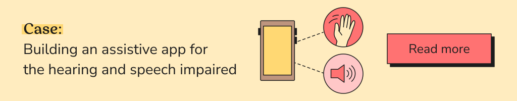
Digital accessibility is still often treated as an afterthought in UX design, whereas the best approach is to prioritize it from the start for ethical and legal reasons. The WCAG guidelines provide an extensive set of standards to ensure digital content is usable by diverse audiences, including people with visual impairments, hearing and motor difficulties, cognitive disorders, or temporary situational challenges.
A well-executed UX audit offers numerous benefits:
- Increased conversion rates: Optimizing website UX best practices reduces drop-offs and encourages action.
- Enhanced brand perception: A polished, user-friendly website builds trust and credibility.
- Reduced development costs: Identifying common UX mistakes early prevents costly redesigns.
- Better accessibility and inclusivity: A user-centric design ensures a broader audience can engage with your product.
Website UX Best Practices: Live Website Reviews & Key Issues
Beetroot’s UX experts, Mykyta Hrach and Maria Kostiuk, conducted a live website UX review to provide constructive, actionable feedback and help site owners and designers enhance usability, visual appeal, and accessibility. Here are some key takeaways from the websites we reviewed:
Color Schemes & Visual Hierarchy
Issue: Many websites lacked a well-balanced color scheme, relying on a single accent color or using too many similar shades, making key areas blend into the background. Some illustrations and text had low contrast which negatively impacted readability and accessibility. A well-structured color hierarchy is essential for guiding user attention and ensuring content is easy to navigate.
Solution: Our experts advised introducing complementary colors to draw attention to important elements like CTAs and headings while maintaining visual consistency. Adjusting contrast levels can improve accessibility, making content clearer and more engaging.
Example: In one UX audit example, the single blue accent color made the homepage feel monotonous. The team suggested incorporating contrasting tones to guide user focus effectively.
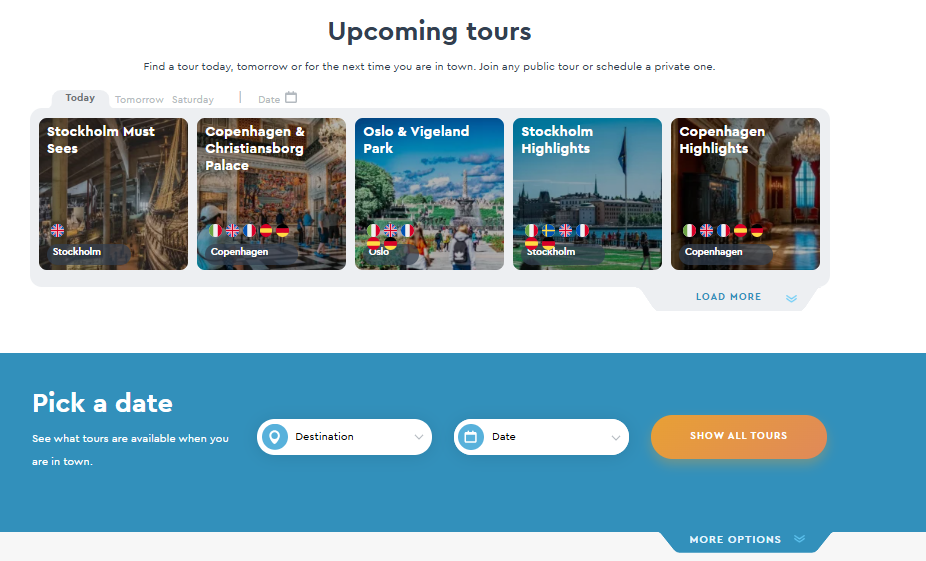
Navigation & User Flow
Issue: Some websites had unclear navigation structures, with overloaded menus or multiple buttons leading to similar pages. Others lacked a logical flow, making it difficult for users to find relevant information quickly. When navigation is unintuitive, it increases bounce rates and frustrates users.
Solution: Our team recommended simplifying navigation by grouping related links, restructuring menus for better clarity, and ensuring that each button serves a distinct purpose. A streamlined user journey improves engagement and conversion rates.
Example: A travel website had multiple navigation buttons leading to similar pages, causing confusion. The team proposed restructuring the navigation bar for better clarity.
Hover States & Interactivity
Issue: Without clear hover states, buttons, and interactive elements may appear static, leading to poor usability and accessibility challenges.
Solution: Implementing visual feedback (e.g., button color changes, micro-interactions) enhances user engagement.
Example: Several reviewed websites lacked distinct hover effects. The team recommended subtle animations and contrast changes to improve interactivity.
Q: “I’ve noticed that many websites don’t use a distinct hover state (for example, those showcased on Lapa Ninja). Is it a trend?”
A: In fact, not having a distinct hover state is more of an anti-trend than a trend. More often than not, it gives the impression that something was overlooked during the design process.
Hover states enhance accessibility and user experience by providing visual feedback during user interactions. However, with so many people designing websites, it’s understandable that some might not consider every detail, including accessibility standards.
To sum up, having distinct hover states is a good practice that helps make websites more intuitive and user-friendly.
Fonts & Readability
Issue: Some websites used outdated or overly decorative fonts that were hard to read. Others had inconsistent font sizes or excessive spacing — either too much space or a lack of clear text hierarchy, making content harder to scan. Poor readability forces users to strain, leading to a higher chance of abandonment.
Solution: Our designers suggested selecting modern, legible fonts for headings and body text while maintaining consistent spacing. Line height adjustments and font size tweaks can significantly improve readability and visual harmony.
Example: A reviewed website had excessive spacing in its hero section, making it easy for users to overlook the slider. Also, the text spacing needed adjustments for better readability. The experts recommended reducing the section height and adjusting font sizes and line heights to improve clarity and UX.
CTA Placement & Hierarchy
Issue: Call-to-action buttons were often placed inconsistently, competing with other elements or lacking sufficient emphasis. In some cases, primary and secondary CTAs were not clearly distinguished, making it difficult for users to take the desired action. Competing CTAs can dilute the conversion flow.
Solution: Our experts recommended refining CTA placement by prioritizing the most important actions (e.g., “Contact Us” vs. “Download”) and visually differentiating primary CTAs. Establishing a clear CTA hierarchy ensures users focus on the primary action.
Example: One website had both a “Download App” and “Contact Us” button in the same color and size, leading to confusion. Our team suggested adjusting the hierarchy by making the primary CTA more visually distinct.
Q: “What is the key action to be done as part of the conversion flow? ‘Contact Us?’”
A: It depends on your product, service, and target audience. “Contact Us” can be effective, but sometimes, a feedback form, download button, or interactive questionnaire might work better.
The type of action should align with what feels intuitive and accessible for your users. For example, a simple feedback form where users can quickly leave their contact information and a question can lower barriers to engagement.
In some cases, live chat might be more effective, especially if your service requires quick responses. Even something as straightforward as a phone number in the header provides a direct way to connect.
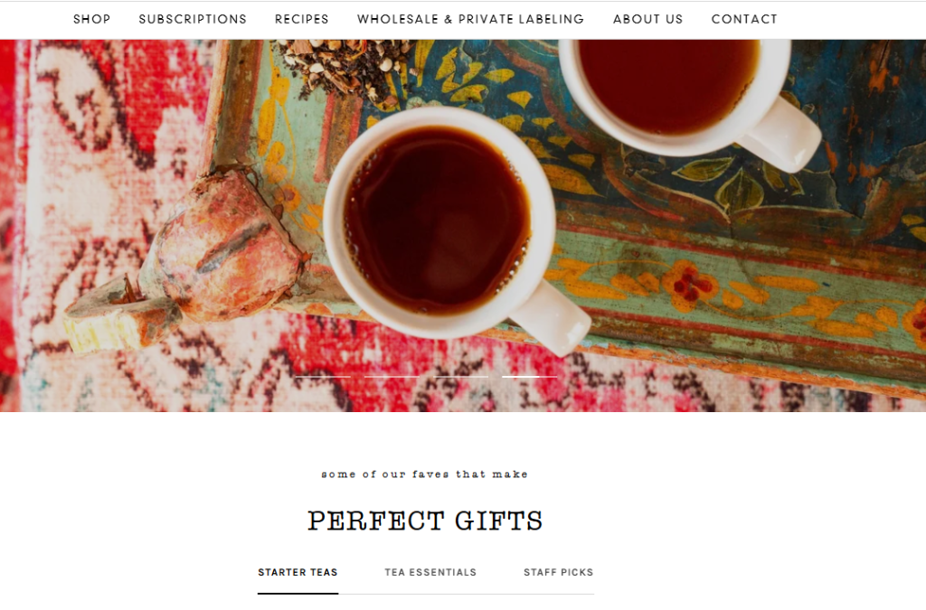
Storytelling
Issue: Several websites underutilized storytelling in their content and visuals. Some relied on generic stock images, while others failed to emphasize their unique value proposition. Without a strong narrative, brands struggle to create an emotional connection with users, reducing engagement and trust.
Solution: The experts advised brands to integrate authentic storytelling by refining copy, incorporating real images, and structuring content to highlight their unique value. A compelling brand story enhances user trust and strengthens conversions.
Example: A tour company’s website had a strong tagline but failed to reflect its unique Scandinavian roots. Our team suggested weaving its cultural identity into the design and content to create a more engaging experience.
UX Design Best Practices for Conducting a UX Audit
When performing a UX audit, focus on the following elements:
Navigation & Information Architecture
Menus, buttons, and page structures should follow a logical flow so users can easily find what they need without confusion and frustration. A well-structured navigation system reduces bounce rates and ensures a smooth user journey across the website.
Content Hierarchy
Users scan before they read, so it’s essential to structure content in a way that places the primary focus on key information. Avoid overwhelming visitors with large text blocks — break up content with headings, bullet points, and visuals to improve readability and engagement.
Form Usability
Forms should be simple, intuitive, and quick to fill out. Reduce friction by limiting the number of required fields, enabling autofill where possible, and providing clear error messages with real-time validation. A well-designed form improves conversion rates and user experience.
Page Load Speed
A slow website leads to high abandonment rates. Optimize performance by compressing images, reducing unnecessary scripts, and leveraging browser caching to ensure fast load times. A well-optimized site keeps users engaged and improves search rankings.
Accessibility Compliance
A truly inclusive website follows accessibility best practices to be usable for wider audiences, including people with disabilities, elderly users, and those experiencing temporary limitations. This means maintaining proper contrast ratios for readability, adding descriptive alternative text for images, and providing full keyboard navigation support.
Engagement Elements
Subtle interactive elements, such as micro-interactions and animated visual cues, can make browsing more intuitive and enjoyable. Thoughtful engagement features guide users through actions naturally while enhancing the overall user experience.
The Impact of a Well-Executed UX Audit
A UX audit is a powerful way to improve website usability, optimize commerce UX, and enhance mobile accessibility. By identifying usability gaps, optimizing commerce UX, and considering mobile accessibility, businesses can create seamless, user-friendly experiences that capture visitors’ attention and drive conversions. Applying best UX design practices ensures that every interaction feels intuitive, reducing friction and improving overall satisfaction.
A well-executed UX audit provides the insights needed to refine your website’s structure, streamline navigation, and elevate accessibility, turning potential frustrations into opportunities for engagement and growth.
Ready to transform your user experience? Beetroot’s UX experts are here to help — contact us today.
FAQ
What is a UX audit?
A UX audit is a structured evaluation of a digital product aimed at identifying usability issues and opportunities for improvement. It involves heuristic analysis, UX research, and accessibility checks to optimize the overall user experience audit.
What is UX research?
UX research is the process of studying user behaviors, needs, and motivations through various methodologies such as usability testing, surveys, and user flow analysis. This research helps designers make informed decisions and create user-centered design experiences.
What is UI design?
User interface (UI) design focuses on the visual and interactive aspects of a product. It includes typography, visual hierarchy, interaction elements, and layout to build an aesthetically pleasing and functional user interface.
What are UX best practices?
UX best practices for websites are established guidelines and design principles that enhance usability, accessibility, and engagement. They include intuitive navigation, clear call-to-actions, mobile responsiveness, and ensuring a visually appealing interface. Following these practices improves user satisfaction and business performance.
What are the differences between a UX review and a UX audit?
A UX review is a high-level UX design assessment based on expert insights, often without deep data analysis. A UX audit, on the other hand, is a more comprehensive UX evaluation process involving detailed research, usability testing, and data-driven recommendations.
What are the next steps after a UX audit?
After a UX audit, businesses should:
- Prioritize UX improvements based on impact and effort.
- Implement quick fixes for high-impact UI/UX issues.
- Collaborate with designers and developers to refine UX/UI elements.
- Conduct A/B and usability testing to validate changes.
- Monitor UX metrics and continuously optimize the user journey.
Subscribe to blog updates
Get the best new articles in your inbox. Get the lastest content first.

Recent articles from our magazine


Contact Us
Find out how we can help extend your tech team for sustainable growth.

