Top Design Trends Shaping Green Tech and Clean Energy Mobile Apps
Contents
Contents
How much of a difference can a green app really make? The answer might surprise you. By implementing smart design choices, like using dark mode and minimalist design, your app can save up to 47% of battery power at higher brightness levels on OLED screens.
That’s just the start. Apps optimized for efficiency at every level—from reducing cloud resource usage to minimizing background processes—improve both user- and environment-friendliness, giving you a sharper competitive edge.
As sustainability becomes a must-have in tech innovation, current website design trends are playing an important role in reshaping how digital products operate behind the scenes. Join us as we explore the top design trends shaping green tech and clean energy mobile apps in 2025 and beyond.
Emerging UI/UX Design Trends in Green Tech and Clean Energy Apps
When it comes to green design trends, the focus is on creating efficient, sustainable digital experiences. It’s not just about how an app looks but how it functions behind the scenes. To start, it’s important to build a strong foundation by bringing together designers and developers who can streamline processes and minimize resource use. Simple steps like optimizing workflows, using low-energy color palettes, and sticking to default system fonts can significantly reduce energy consumption. Mobile-first and responsive design are also essential—by prioritizing key features for users with smaller screens, you cut down on unnecessary content, speed up load times, and boost the overall efficiency of your app.
For an in-depth exploration of the most impactful UI/UX design trends for 2025, be sure to read on our key observations are listed below.
Minimalism: Reducing Resource Use Through Simple Designs
Minimalism in green app design is more than just a trend—it’s an effective strategy for reducing environmental impact. By adhering to the “less is more” principle, minimalistic UI/UX features prioritize essential content and functionality, eliminating clutter and unnecessary elements that can slow down performance. Minimalistic designs focus on clean, user-friendly experiences that minimize energy consumption and data usage.
Key elements of minimalism include:
- Flat design: Using two-dimensional elements and avoiding skeuomorphic designs reduces processing power and memory usage.
- Whitespace/negative space: Effective use of whitespace keeps the interface clean and easy to navigate, while reducing cognitive load for users, which has been shown to improve engagement.
- Simplified navigation: Streamlining menus and user flows reduces the number of actions a user must take, making the experience more intuitive and energy-efficient. Research shows that simplifying navigation can reduce bounce rates by up to 20%.
- Simple, readable typography: Using system-default fonts over custom ones not only improves readability but also reduces the number of HTTP requests, lowering energy usage.
- Monochromatic or limited color palettes: Restricting the use of multiple colors and sticking to a few muted tones reduces energy consumption, especially on OLED screens, while reinforcing the eco-conscious message of the app.
- Icon-based interactions: Simplifying action buttons to icons rather than text-heavy options speeds up user interaction and reduces resource consumption.
Apps designed with minimalist principles require less computational power and data to operate. This not only makes the app run faster but also helps reduce overall energy usage, contributing to a more efficient and sustainable digital experience. For eco-conscious users, this reduction in resource use aligns with their values and reduces the overall environmental impact of the app.
Dark Mode: Benefits and Implementation for Energy Savings
Dark mode has evolved from a mere aesthetic option to a key feature for energy savings in green tech apps. It works particularly well on OLED and AMOLED screens, where dark pixels use significantly less energy than light ones. This reduction in pixel power can extend battery life by up to 30%, making it a vital feature for both users and developers focused on sustainability.
Greenspector research shows that using dark mode reduces energy consumption by an average of 20% and slows battery drain by 18% compared to light mode. On text-heavy apps like Twitter, LinkedIn, and Facebook, dark mode is especially efficient, as it inverts colors, displaying white text on a black background.
Energy savings:
- Research by Purdue University found that dark mode can reduce battery consumption by 39% to 47% on OLED screens, depending on the screen brightness level.
- Beyond battery savings, dark mode also benefits users by reducing eye strain during extended app use. This feature has gained significant popularity, with an estimated 81.9% of smartphone users opting for dark mode when available.
For Green Tech apps aiming to reduce their environmental footprint, dark mode is a simple yet effective feature. By allowing users to engage with their app in an energy-efficient manner, it contributes directly to the app’s sustainability goals while improving user experience.
Accessibility: Designing for Inclusivity and Resource Efficiency
With nearly 16% of the global population living with some form of disability, according to the World Health Organization, designing accessible apps is not only a legal and ethical responsibility but also an essential aspect of sustainable UI/UX design. Inclusivity means ensuring that apps can be used by everyone, regardless of their physical or cognitive abilities. By creating more accessible designs, green tech apps contribute to reducing digital exclusion while enhancing resource efficiency.
Key accessibility features include:
- Voice-activated controls: These not only assist users who find standard touch controls challenging but also offer an energy-saving alternative to navigating through touch-intensive menus.
- Screen reader compatibility: Ensuring that apps work seamlessly with screen readers improves inclusivity for users with vision challenges..
- High-contrast and color blind modes: Offering modes for users with sight challenges improves accessibility, while also potentially reducing the energy use of bright, light-heavy UI designs.
- Thumb-friendly design: Making apps easy to navigate with just one thumb improves usability and engagement for a wide range of users, while simplifying the interface and cutting down on unnecessary actions.
Focusing on accessibility helps green apps become more streamlined, requiring less processing power. This not only improves inclusivity but also makes these apps compatible with older or lower-end devices, reducing the need for frequent hardware upgrades and helping minimize electronic waste.
A great example of accessibility in action is Speak’n’Hear, a Beetroot R&D project. This mobile app facilitates communication for individuals with hearing and speech differences by transcribing audio, synthesizing speech, and converting spoken language into text. For those with hearing challenges, it transforms speech into text, while non-speaking users can take advantage of its text-to-speech feature. This dual functionality provides comprehensive support for communication needs, including telehealth services.
User Experience and Engagement in Clean Tech Apps
Apps for Greentech must prioritize delivering an optimal user experience while maintaining sustainability. These apps often depend on cloud computing, but without optimization, cloud services can become resource-heavy. By utilizing strategies such as load balancing, data compression, and serverless architectures, green tech apps can significantly reduce server energy demands, cutting their carbon footprint.
Focusing on mobile-first and responsive design is essential. Since users are quick to abandon apps that are slow or provide a poor user experience, it’s crucial to ensure seamless and efficient mobile interactions to keep users engaged with sustainability-focused content and features. Now, let’s explore the green design trends that enhance user engagement.
Educational Content Boosts Retention
CleanTech apps that include educational content, such as sustainability tips or insights into green practices, tend to see higher user retention rates compared to those without these features. Users are more likely to stick with apps that offer practical value by helping them improve their eco-conscious behaviors.
Many clean tech apps incorporate educational elements to inform users about sustainable practices and the environmental impact of their activities. This valuable information fosters an engaged user base, turning app users into advocates for sustainable living. Common features like infographics, eco-friendly tips, and environmental challenges help build a sense of responsibility and encourage users to stay engaged.
Personalization Increases Engagement
Apps that provide personalized content and recommendations often see increased user satisfaction and significantly higher engagement rates. This is particularly important for clean tech apps, where users expect tailored advice on energy usage, carbon footprint reduction, and other sustainability tips.
Personalization in Green Tech apps allows users to receive tailored suggestions based on their specific energy usage, carbon footprint, or eco-friendly goals. For instance, an app could recommend specific green energy solutions or lifestyle changes based on a user’s habits. This makes it more likely that users will adopt and commit to sustainable behaviors.
Powered by AI and machine learning, personalization offers targeted suggestions that resonate with individual users. By showing only the most relevant content, apps reduce their data load, making them more efficient and contributing to lower energy consumption.
Gamification Drives User Actions
Clean tech apps that integrate gamified environmental goals strive to encourage users to make eco-friendly choices, leading to measurable impacts like reduced energy consumption or increased recycling.
Gamification techniques—such as progress tracking and rewards systems—are being widely used in green tech apps to engage users in fun and meaningful ways. For example, apps might reward users for reducing their energy consumption or completing eco-friendly challenges, providing positive reinforcement for sustainable actions.
Some examples of gamification in green tech apps include:
- Challenges: Set daily or weekly goals, like reducing energy use or carbon footprints, with rewards like points or badges.
- Progress tracking: Users can track how their actions contribute to their sustainability goals, keeping them motivated.
- Leaderboards: Comparing progress with others encourages friendly competition and community engagement.
By making sustainability interactive and rewarding, gamification drives real-world eco-friendly behaviors and increases the time users spend on the app, strengthening user loyalty while promoting environmental responsibility.
Balancing Wow-Effect with Environmental Impact
A clean, easy-to-navigate interface is crucial for engaging users, as many prefer apps that prioritize simplicity. For Clean Tech apps, this means reducing cognitive load and making features like energy usage tracking and eco-friendly tips easily accessible.
However, green tech app designers face the challenge of balancing impressive visual effects with the app’s environmental impact. Flashy animations and high-resolution graphics may look appealing, but they also increase energy consumption, which undermines sustainability goals. The key is to create visually engaging experiences without unnecessarily draining resources, ensuring a balance between aesthetics and environmental responsibility.
The Future of Sustainable UX/UI Design
The future of green UX/UI design focuses on creating user-friendly, environmentally responsible experiences. Circular design thinking is gaining traction, emphasizing modular, long-lasting digital products that reduce waste throughout their lifecycle. This approach ensures apps are built for longevity, minimizing electronic waste by making updates seamless.
On the development side, green coding plays a leading role. Clean, resource-efficient code reduces computational demands, making mobile apps faster and less energy-intensive. As sustainability standards grow, designers and developers will need to follow frameworks like Sustainable Web Design to lower the carbon footprint of digital products.
The future of UX/UI will also be increasingly user-centered, helping users make more eco-friendly choices by providing insights into their energy consumption and environmental impact. This empowers users to engage with technology more consciously, further promoting sustainable design.
The Role of AI and Machine Learning in Green Software Design
AI and machine learning are transforming UX/UI design in green tech. These technologies optimize app performance, personalize user experiences, and reduce resource consumption by analyzing user behavior and predicting needs. AI-driven algorithms dynamically adjust features based on user preferences, reducing waste and energy usage.
By processing environmental data, AI identifies patterns and predicts outcomes, helping optimize renewable energy use and forecast ecological changes. This improves both business and consumer sustainability efforts.
Key benefits of integrating AI into green apps include:
- Improved efficiency: AI optimizes app operations, reducing the environmental footprint.
- Enhanced accuracy: Machine learning models analyze data, offering better insights for eco-conscious decisions.
- Better user engagement: AI-powered personalization, chatbots, and adaptive interfaces enhance user experience and encourage sustainable practices.
Emerging Design Technologies and Their Potential Environmental Impact
As technologies like augmented reality (AR) and virtual reality (VR) grow, their resource-intensity must be considered. The challenge for UX/UI designers is to integrate these tools while minimizing energy consumption, ensuring wide accessibility without increasing the carbon footprint.
Other tools for green app development include:
- Automation: CI/CD pipelines and code linting tools optimize resources by automating processes.
- AI-driven optimization: Tools like TensorFlow Lite enable efficient on-device processing, reducing cloud energy use.
- Cloud and edge computing: Solutions like AWS Greengrass and Azure IoT Hub minimize cloud processing and energy demands.
Progressive Web Apps (PWAs) are increasingly recognized for their efficiency, consuming fewer resources compared to native apps. Their lightweight design and faster load times contribute to improved energy performance.
Challenges in Green Tech UI/UX
As apps for Green Tech grow in popularity, UX/UI designers face several challenges in balancing sustainability with user experience. From greenwashing to limited resources, designers must overcome hurdles that threaten the integrity of sustainable design.
Greenwashing
One of the major challenges in green tech is greenwashing—where companies exaggerate or falsely claim their products are environmentally friendly. For UX/UI designers, transparency is critical. Misleading claims not only damage a company’s reputation but also undermine the entire mission of promoting sustainability.
To combat this, app designs should be clear and honest about their eco-friendly features. Avoid using vague language or exaggerated visuals. Instead, focus on real, measurable impact. Providing clear, verifiable information about how green initiatives are incorporated into the app can help build user trust and reinforce the company’s commitment to sustainability.
Common Obstacles in Adopting Sustainable Design Practices
Implementing sustainable design is easier said than done. Many companies face challenges such as:
- Lack of resources: Sustainable design often requires specialized tools, teams, or processes, which can be expensive or unavailable.
- Knowledge gaps: Teams may lack the expertise needed to incorporate sustainable practices into the design process.
- Higher initial costs: Eco-friendly design solutions can sometimes cost more upfront, making it harder to justify the investment, especially under tight deadlines or budgets.
Another obstacle is balancing sustainability with performance. Ensuring the app remains visually appealing and high-performing without increasing energy consumption is a tough challenge, particularly when teams are pressed to meet both sustainability and business goals.
Solutions to Overcome Obstacles
To overcome these challenges, UX/UI designers can focus on incremental changes rather than attempting to overhaul an entire design process all at once. Adopting energy-efficient design principles gradually can lead to significant improvements over time without overwhelming teams.
Building partnerships with Green Tech organizations or experts can also help bridge knowledge gaps and provide valuable guidance on sustainable design best practices. Collaboration with sustainability communities can offer insights into new tools, techniques, and standards that prioritize eco-friendly development.
Finally, leveraging tools and platforms designed to minimize resource consumption during app development ensures sustainability is a core part of the process. Designers can integrate these tools into their workflow to monitor energy usage, optimize performance, and ensure sustainable practices are maintained from the ground up.
Case Studies: How Green Web Design Trends Work in Practice
The Beetroot team has worked on several GreenTech projects, with Homenergy standing out as one of the most interesting from the perspective of current website design trends. This R&D project is an electricity tracking app designed to help homeowners manage their power usage more efficiently, promoting sustainable practices. As a tech partner for GreenTech companies, we stay up-to-date with the latest industry trends and focus on areas like household electricity management, which we believe can significantly reduce carbon emissions and contribute to a cleaner environment.
Homenergy allows homeowners to monitor and understand their energy consumption through various features:
- Power usage breakdown: The app provides detailed data on electricity consumption by day, week, or month, showing how much energy is used by different appliances at specific times.
- Multiple appliance connections: Users can connect and monitor a range of smart devices, including bulbs, WiFi systems, plugs, vacuums, and TVs.
- Data collection: The app gathers consumption data from connected devices and user-generated content (such as device names), ensuring that all data is encrypted in transit for security.
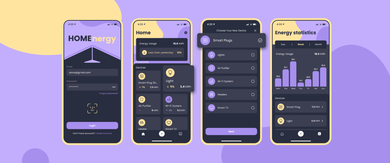
The initial version of Homenergy was built using the Expo SDK, allowing us to create native iOS and Android apps. It utilizes IoT protocols (MQTT, AMQP, HTTP) for device communication and AWS services like SNS for notifications, Lambda for backend logic, Cognito for authentication, and DynamoDB for data storage.
Another exciting project is InviSense, where Beetroot developed an intuitive app to improve sensor installation and data reading at construction sites. InviSense specializes in sensor technology that monitors moisture levels in buildings, helping prevent water damage and optimize maintenance.
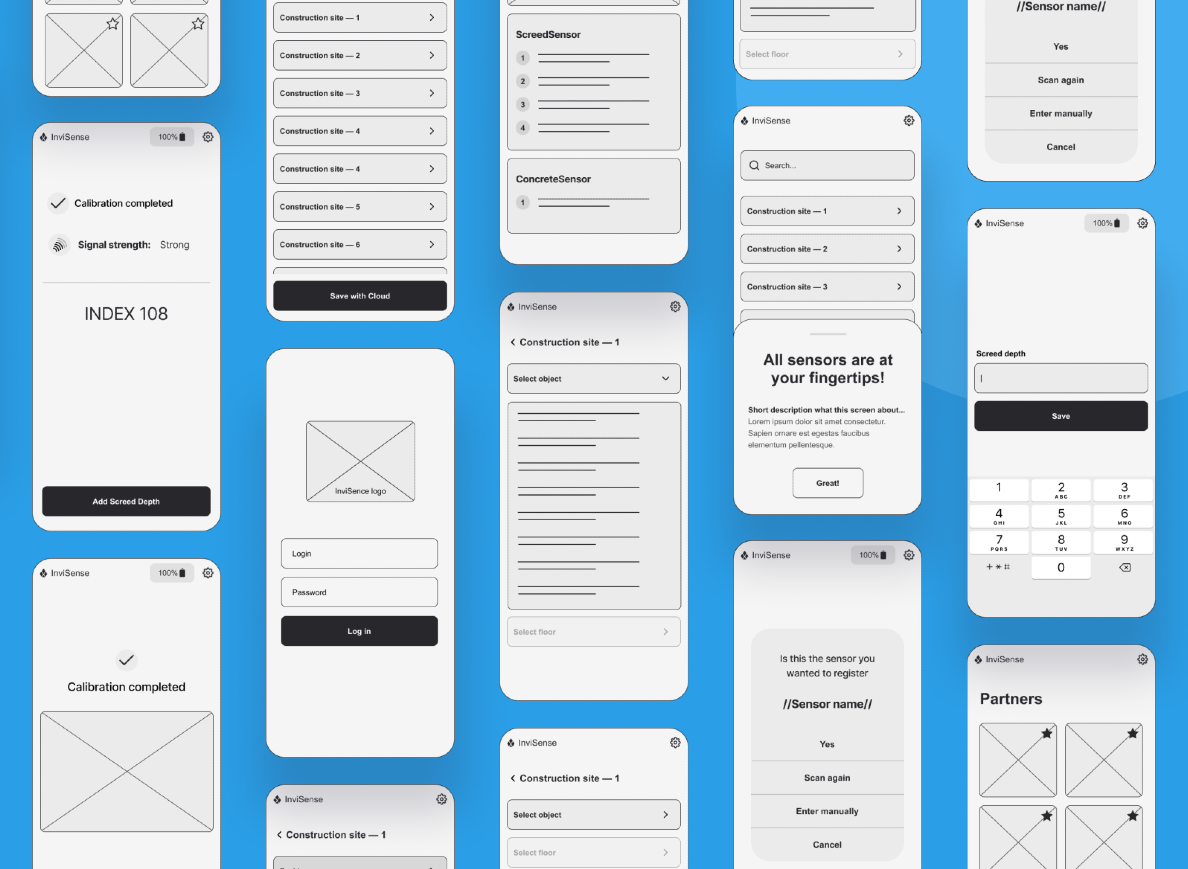
Before partnering with Beetroot, InviSense struggled with an app that was both confusing and ineffective. We addressed these challenges by:
- Conducting a discovery phase to pinpoint specific issues.
- Creating wireframes and flow maps to streamline key functions.
- Designing a user-friendly interface that aligns with the client’s brand and significantly improves the user experience.
Both projects highlight the importance of incorporating green design trends into tech solutions, driving sustainability and supporting impact-driven initiatives through innovative and eco-conscious technologies.
Design for efficiency, drive tech for positive impact.
The top design trend in green tech is creating efficient, user-friendly, and sustainable experiences. Key trends include minimalist design to reduce resource consumption, dark mode for energy savings, AI-driven personalization, gamification to increase user engagement in eco-friendly practices, and optimizing apps for lower energy use with minimal environmental impact. These trends strike a balance between performance and sustainability, aligning technology with green initiatives.If you’re looking for an experienced design team to help make your project more sustainable, reach out to us! The Beetroot team is dedicated to green design and development, and we’re ready to help you stay green and sustainable.
Subscribe to blog updates
Get the best new articles in your inbox. Get the lastest content first.
Recent articles from our magazine
Contact Us
Find out how we can help extend your tech team for sustainable growth.
